
Car Rental App Redesign
UX/UI Case Study
Overview
- 5 months
- End-to-end design process
- Mobile
- iOS and Android experience
- Solo
- Research, UX, UI, and prototype
- 1 flow
- Search through completed booking
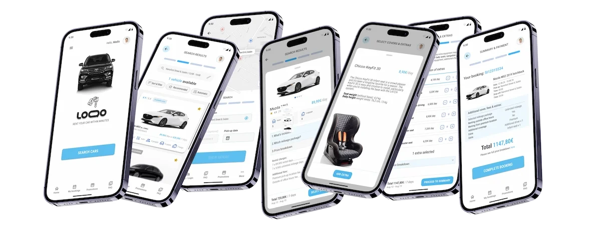
This solo project explored how a car rental app could make booking more approachable. The work focused on helping customers compare vehicles, understand costs, and reserve a car through fewer, more predictable steps. The redesign balances speed with the information people need to make a confident choice, from useful filters and clearer price breakdowns to a less disruptive guest checkout experience.
Problem
Car rental customers often complain that most mobile apps feature non-transparent or even incorrect pricing. Apps include distracting promo banners and login pop-ups, hindering a smooth booking process. Pricing explanations contain confusing acronyms, further eroding trust between end users and rental companies. This poor user experience negatively impacts rental businesses, resulting in fewer orders.
Scenario A
Pricing
- 01
Total price is unclear
Fees and cover costs appear late or change between search results and checkout.
- 02
Customer trust declines
Customers question whether the offer is accurate and pause to compare alternatives.
- 03
Bookings move elsewhere
More transparent competitors become the safer and easier choice.
Scenario B
Booking terminology
- 01
Cover options are difficult to decode
Terms such as CDW, LDW, and PAI appear without enough plain-language context.
- 02
Decision confidence drops
Customers cannot tell what they need, what is included, or what are the trade-offs.
- 03
Checkout is abandoned
Uncertainty interrupts the booking flow before customers complete payment.
The average rating for four major car rental company apps in Google Play Store is 3.65 on a 5-point scale

Very poor. Searching/booking for cars sometimes works, but can also be 200% more expensive than simultaneous search on website/laptop. You have to check.

Account charged for 3 times for the full amount without successful booking. Every attempt to book would result in an error message. This should not be possible by design. At the moment I have no idea how to retrieve my money.

Made two booking at nearly same time. One on app and one online. App one did not include the basic insurance. 3£ per day insurance through website on other booking. Ended up costing 30£ per day for same insurance at airport. Will not risk booking though app again.

Never trust this company. After renting the car and paying online, we went to get the car, first they offer different car than what we chose, and they asked to pay 1500£ for insurance. Went to another company and rented a car without any hidden fees or unclear details.
Key insights
27%
of research respondents preferred using a mobile app instead of a desktop site, indicating low mobile adoption for online rental services.
18%
of research participants rated the overall online car rental experience 5 out of 5, the highest possible score.
Research & discovery
- 01
Competitive Benchmarking
Competitive benchmarking let me study how similar rental companies address common booking problems without recruiting participants.
Discovery: One company advertised a 15% discount for online payment. Yet 15% off €573.76 is €487.70—not the advertised €500.15.
Read Full Review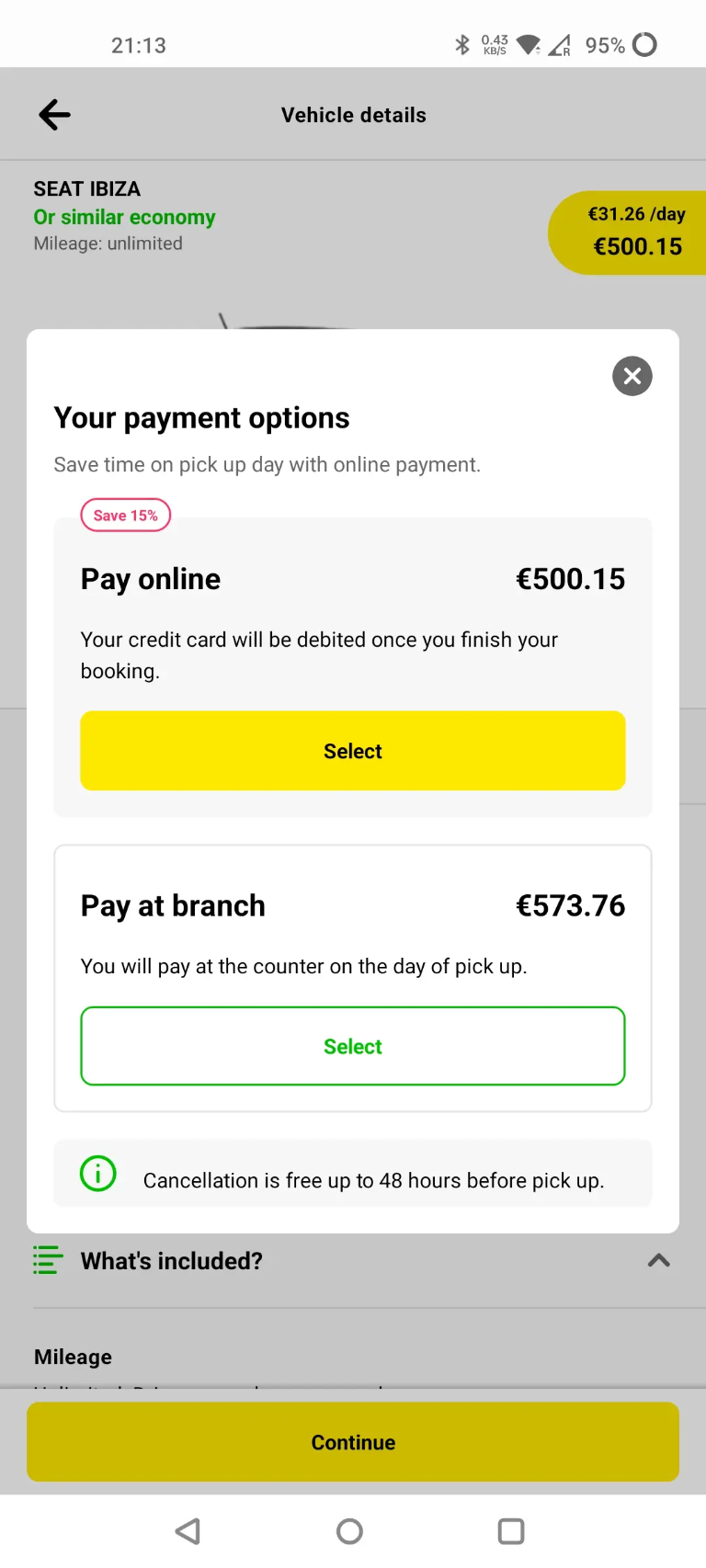
- 02
Online Survey
I used an online survey to identify where rental customers struggle and gather both quantitative and qualitative evidence.
One question asked, “What would you change about the app you used?” The responses reveal recurring needs for clearer pricing, simpler booking, and fewer advertisements.
Read Full Survey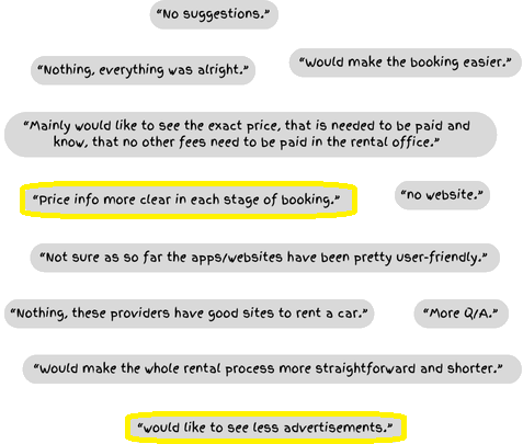
- 03
Usability Testing
Observed customers completing core booking tasks to uncover comprehension issues and points of hesitation.
Helen about Sixt “When using any type of booking sites, I usually do not sign-up places that I do not use occasionally.”
Helen about Sixt “I don’t understand what is premium location fee and in which step was it added to my order?”
Mary & Sarah about Green Motion “I did not understand what CDW means and what are the risk reductions.”
Journey & structure
- 01
Search
Set location and dates, then refine results with meaningful filters.
- 02
Select
Compare vehicles using consistent specifications, availability, and pricing.
- 03
Customize
Choose cover and extras with contextual explanations and visible price changes.
- 04
Review and pay
Confirm the complete order, customer details, and final price before payment.
Sketches
Early sketches explored search results, vehicle details, step order, and the information needed at key decision points. Comparing several directions made it easier to identify weak assumptions before moving into wireframes.
- Search and filter entry points.
- Vehicle list and comparison patterns.
- Pricing, extras, and cover selection.
- Checkout progress and review states.
Design & prototype
The interface uses stronger spacing, a clearer type hierarchy, consistent vehicle cards, and contextual price details to improve scanning without reducing useful information. The interactive prototype supports realistic tasks across filtering, comparing cars, selecting extras, reviewing the price breakdown, and completing payment.
- Reusable vehicle, pricing, and selection components.
- Clear selected, loading, empty, validation, and error states.
- Touch-friendly controls and mobile-first hierarchy.
- A connected prototype covering the complete booking journey.
Reflections
Future content in this section should pair observed usability findings with the changes made between iterations. Quantitative outcomes should only be shown when supported by analytics or a structured study.
Outcome principle
Show what changed because of testing, then connect that change to customer or business value.
- Explain the most important design trade-off and why it was made.
- Separate validated learning from assumptions that still need testing.
- Identify the next research question or product experiment.